 We made the point earlier that Michael C's designs are in the Bob Mackie mold and that's still true, but maybe a bit of a disservice to him because it implies he's a costume designer. If we were to pick more modern designers for comparison, we'd toss out names like Reem Acra and Elie Saab; designers who trade in red carpet-ready looks that aren't particularly concerned with the latest trends so much as with providing maximum drama. With his flowy, shiny, beaded and feathered looks, Michael's bringing his Palm Springs aesthetic to the runway.
Let's start the show.

Our second issue (we'll get to the first in a second) with Michael's collection is the color story. These drab, dusty non-colors worked against the kind of glam he was going for with this collection. We suspect he thought the color choices gave the looks some sort of "New York-y" sophistication. This dress is clearly a variation on his challenge-winning Lady Liberty dress. Like that entry, this dress is sexy and breezy, but not at all new or modern.

It's just alright. To be honest, it looks a bit overworked. We don't love the belt, which looks a bit, well, crafty.

Very strange bust on this look. The cups looks sloppy and lopsided. Slopsided. As for the rest of it, haven't we seen this dress quite a few times in the last couple of years?
And that's our first issue with this collection: there's nothing new about any of it.

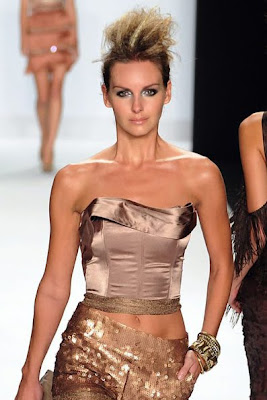
Those pants are hideous and about a Cher Level Five on the tacky scale. The top is pretty tacky too, but we admit there's something a little interesting about it. Had it been part of a dress instead of a tacky vest and pant combo, it could have been something.

Strangely, this is the most modern look in his collection, but that's only because hot pants are trendy right now. Gold sequined hot pants? Not so much.

There's some interest in the construction of the top, but he went WAY overboard on the skirt. Pick one, maybe two elements, Michael.

Very Halston-y. Very much that breezy-glam Palm Springs look.

Again, haven't we seen the cocktail dress with the feathered skirt a lot in recent years? We do like the colors here, though.

Credit where it's due, this is a bold, glamorous and most importantly, eye-catching look. We think the shades of grey and black are a bit incongruous with the rest of the collection and there's perhaps a bit too much bling around the neck, but this is our favorite of his looks.

This, we're sorry to say, is just silly-looking. The boobs are coming out of nowhere (and that top is a mess), and the skirt looks overworked to the point of exhaustion. We like the colors here but this look is a total needlescratch of a moment.
 In the end, he showed a collection that lacked polish and wasn't particularly fresh or fashion-forward, but nonetheless perfectly represented his shiny, glamorous Palm Springs point of view. We don't think he was ever really winner material as it pertains to a design competiton, but there's not a reason in the world he can't have a good career dressing starlets for events. It's exactly the kind of work he was made to do.
[Photo Credit: getty/wireimage]
Post a Comment
Labels: Michael Costello, Project Runway, Project Runway Season 8, Project Runway Season 8 Episode 13, Project Runway Season 8 Final Collections


